PROJECTS

SJEDS Rebrand

A research-led reimagining of San Jose Episcopal Day School's visual identity, bringing together institutional heritage, modern design, and a cohesive brand system that distinguishes the school while celebrating its Episcopal roots.
CLIENT
San Jose Episcopal Day School
YEAR
2025–Present
ROLE
Brand Strategy & Design
DELIVERABLES
Identity & Brand Guidelines

A distinct identity.

San Jose Episcopal Day School is a small, independent Episcopal school serving just over 200 students from Pre-K3 through sixth grade. Sharing a campus and a longstanding relationship with San Jose Episcopal Church, the school faced a unique branding challenge: establishing a more recognizable educational identity while preserving its connection to the church.

Beginning in fall 2025, I led an initiative to rethink the school's visual identity, starting with leadership consultation and community research. The project evolved into a comprehensive brand system encompassing logo development, typography, color, institutional symbolism, and practical guidelines for consistent communication.The objective was to create an identity that reflected the school's academic purpose, welcoming community, and Episcopal heritage while providing a clearer, more cohesive foundation for its future.

Understanding the school before redesigning it.

The process began with consultations with school leadership and a community survey designed to understand how SJEDS was perceived and how its identity should evolve. The existing logos presented several challenges, including redundant typography, complicated compositions, inconsistent visual treatments, and limited versatility across print and digital applications.

The initial survey revealed a clear preference for an identity that balanced tradition with contemporary design. 75% favored a blend of traditional and modern aesthetics, while 91.7% wanted to avoid childish or cartoon-like imagery and 87.5% opposed overly complex crests. A deeper navy palette with gold or cream accents emerged as the leading color preference at 54.2%, while 58.3% favored retaining Episcopal symbolism through a subtle or stylized cross. Respondents also identified warmth and community (70.8%), faith and grounding (66.7%), and academic excellence (58.3%) as defining characteristics.

Versatility was another significant consideration, with 75% rating adaptability across print, digital, signage, and uniforms as extremely important. These findings informed the development of a cohesive visual system that could accommodate departmental identities while maintaining a recognizable institutional presence.

A second, blind perception survey evaluated two variations of the proposed primary icon: one incorporating a cross within the open book and another without it. 82.4% preferred the version featuring the cross, compared with just 3.9% who preferred the alternative. Open-ended feedback revealed that the cross-bearing design was more readily associated with Christian education, faith, family, and guidance, while the alternative was more frequently interpreted as representing general education, literacy, or a library.

Together, these findings reinforced the creative direction: an approachable yet sophisticated identity that communicates SJEDS's educational mission, preserves its Episcopal heritage, and strengthens recognition as a distinct school within the broader San Jose Episcopal community.


A symbol of learning and belonging.

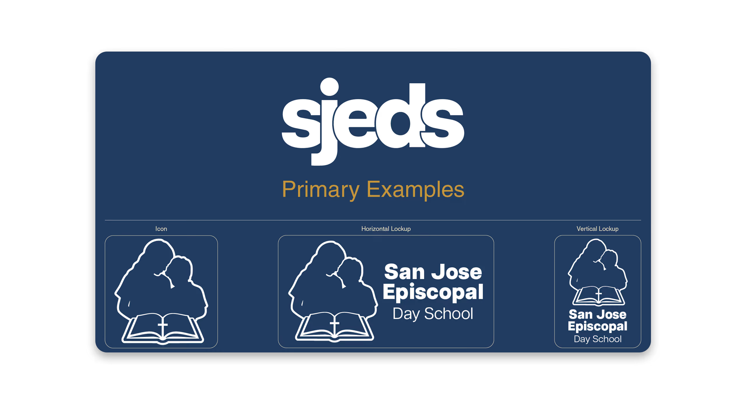
At the center of the proposed visual identity is an illustration of two students reading together, representing the connection, mentorship, and shared learning that define the SJEDS experience. An open book establishes the school's educational purpose, while a subtle cross incorporated into its pages reflects the Episcopal faith at the heart of the institution.

The design moves away from the complexity of the previous identity in favor of a more meaningful and recognizable symbol. Developed in horizontal and vertical configurations, with full-color, reversed, and monochrome variations, the primary logo was designed to remain consistent across different formats and applications.

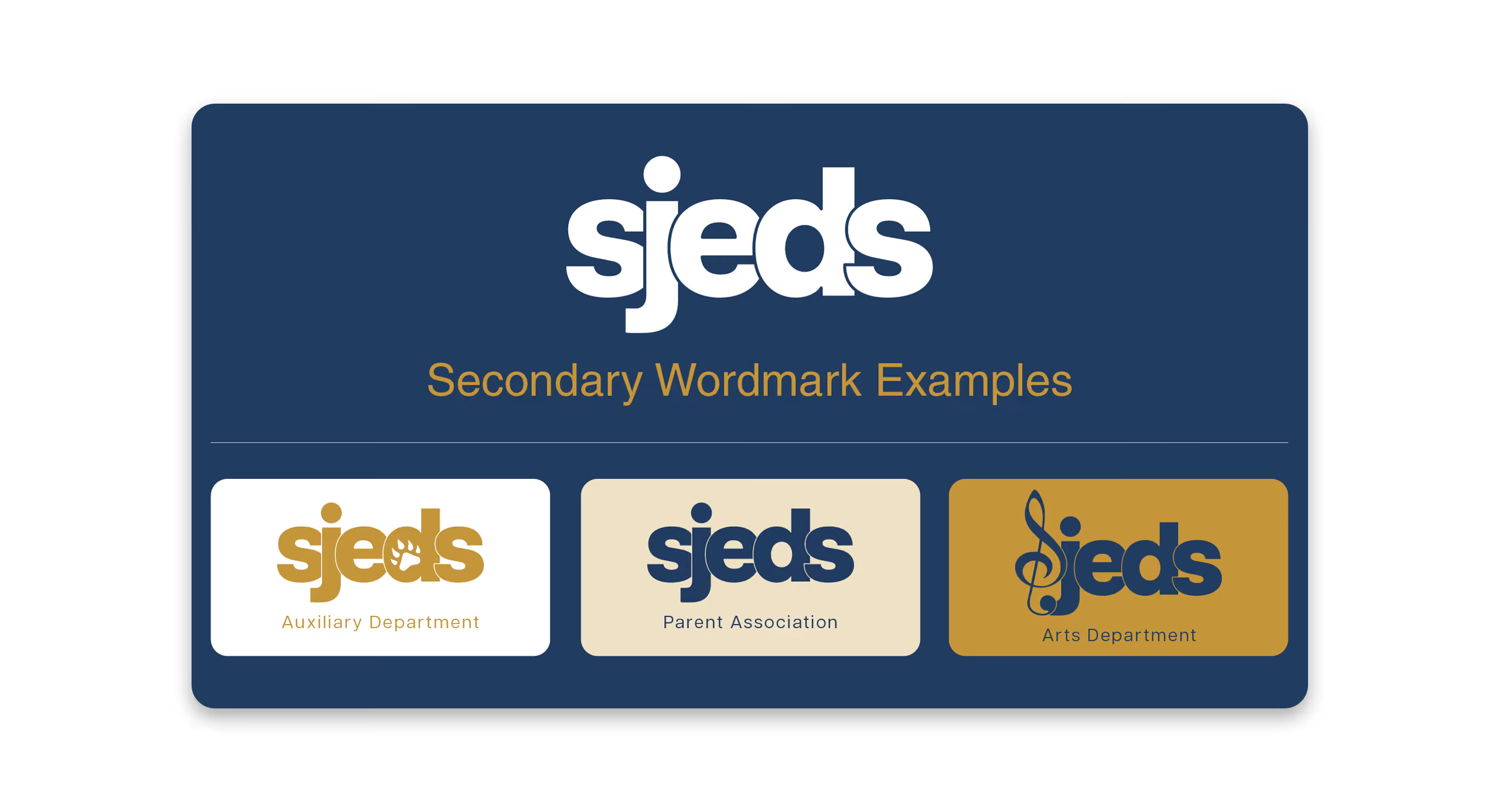
Alongside the primary mark, I developed a complementary SJEDS wordmark and secondary identities for individual departments and programs, creating a flexible visual language that could extend throughout the school.

SJEDS Motion Identity / Logo Animation & Motion Design

A cohesive identity, built to adapt.

The redesigned identity extends beyond a single logo into a coordinated visual system. A bold SJEDS wordmark provides a recognizable foundation for departmental identities, including athletics, arts, alumni, and other school programs. Each variation maintains a consistent structure while incorporating symbols that reflect its individual purpose.

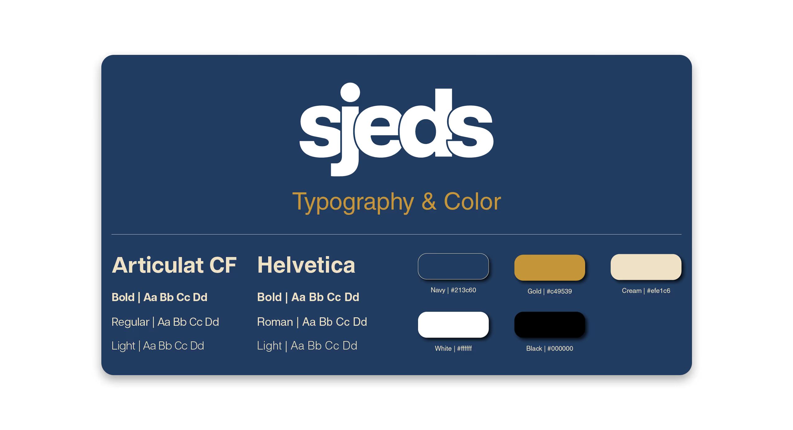
The visual language is grounded in a refined palette of navy, gold, and cream, paired with Articulat CF for its clarity and contemporary academic character. Helvetica also serves as a practical body typeface across many of my communications and design applications. Together, these choices support a brand voice that feels warm, confident, approachable, and rooted in the school's educational mission.

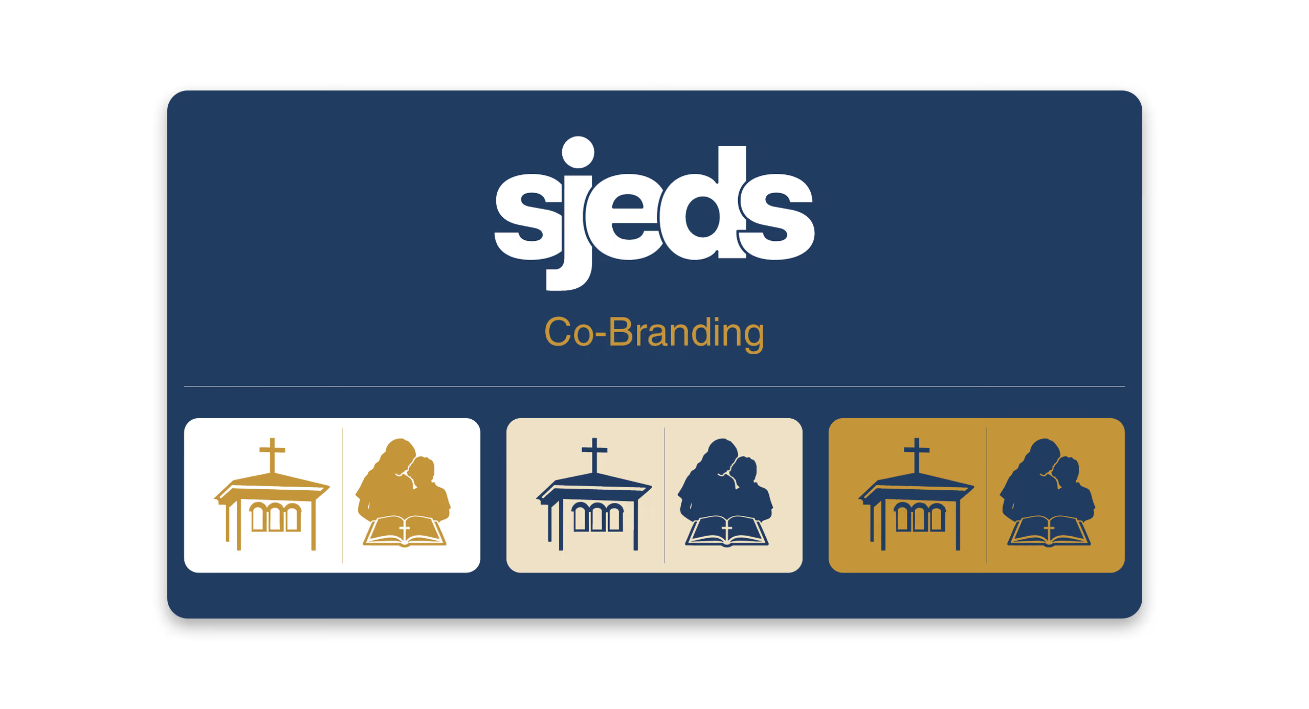
The historic crest remains an important expression of SJEDS's heritage. I also introduced a consistent co-branding arrangement for communications shared with San Jose Episcopal Church, placing the church's tower logo first, followed by a vertical divider and the school crest. This hierarchy acknowledges the church's institutional leadership while allowing the school to maintain its own recognizable identity.

A stronger foundation for the future.

The rebrand established a comprehensive visual identity system informed by leadership consultation, community feedback, and a detailed evaluation of the school's existing brand. The resulting guidelines brought together logo architecture, typography, color, visual standards, and brand messaging into a cohesive framework for future communications.

Elements of the system have since been incorporated into the school's visual presence, including the SJEDS secondary identity, consistent use of the historic crest, and a standardized co-branding arrangement with San Jose Episcopal Church. These applications have helped establish a more unified approach to school communications across print and digital platforms.

Beyond the individual designs, the project created a strategic foundation for how SJEDS can communicate its identity: recognizable as a school serving Pre-K3 through sixth grade, connected to its Episcopal heritage, and equipped with a flexible visual language that can evolve alongside the institution.